EcoFill
An interface design for a grocery store soap refill kiosk & web experience.
- Case Study and Front-End Development Prototype -
The original idea for the refill station came to me a few years ago after being faced with yet another statistic about our plastic waste problem. I thought, “Why doesn’t this exist yet? We could totally implement this in stores”. Needless to say, it was exciting to see this idea come to life with my team in our UX/UI Bootcamp.
Case Study prepared for: UX/UI Bootcamp, University of Texas at Austin
Timeline: 3 weeks | Project Dates: 4/3/2021-4/20/2021 | Team of 3

EcoFill: A soap refill station.
MY ROLE: UX/UI Designer, Front-End Developer
MY RESPONSIBILITIES:
Overall Design Concept & Name
Problem Statement, User Insight, User Persona, Storyboard
User Flow
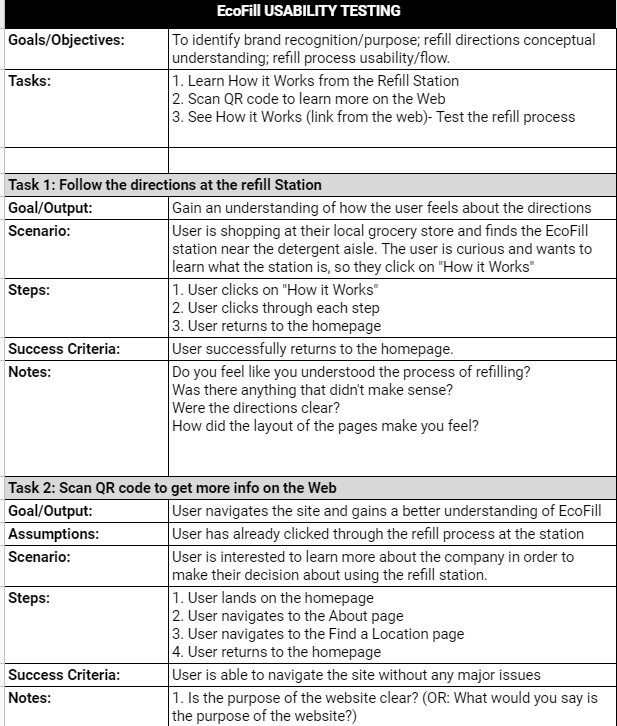
Usability Testing Plan, User Testing
Mid-Fidelity Wireframes & Prototype
UI Design (Station Interface) & Mockup Prototype
Bootstrap, HTML/CSS
THE PROCESS
EMPATHIZE
Gather data: Interviews & Survey / Synthesize data: Affinity diagram
DEFINE
User persona
User insight / Problem statement
IDEATE
Brainstorm solutions / Features Storyboard / User Flow / Sketching
PROTOTYPE & TEST
Mid-fi Wireframes / Prototype / Test
Mockup / Front-End Development Prototype
EMPATHIZE & DEFINE
My main contributions:
2 User Interviews | Persona Creation | User Insight & Problem Statement
USER PERSONA
After completing 6 user interviews and gathering more research from a survey that had 76 responses, we completed an affinity diagram and an empathy map as a group. With the user pain points, wants, and needs discovered, I was able to cultivate our user persona.
USER INSIGHT
The average consumer is apprehensive about human impact on the planet and is willing to make eco-friendly changes if provided, but has limited time and needs a convenient way to help mitigate the problem and make lasting habits.
OUR PROPOSITION
Our team is developing a grocery store refill station to empower the average consumer to reduce their plastic waste and create more sustainable habits by providing a fulfilling experience within the convenience of their everyday shopping trips.
IDEATION
My main contributions:
Brainstorming Solutions | Storyboard | Refill Station User Flow
Funneling Solutions
With the persona defined, I began the brainstorming process. After revisiting our research, I targeted mid-level solutions and finally decided on the features for our design:
Convenient grocery store placement
Informative & reliable web experience
Inviting interface & “Impact statement” upon checkout
STORYBOARD
Based on our qualitative and quantitative user research, I defined Michaela as someone who knew about plastic waste but was never really presented with a lasting opportunity to change her habits (at least, not without spending more money and/or devoting time and energy she didn’t have to give). The storyboard highlights how our product gives Michaela and other consumers a welcomed and happy discovery of a new routine, while providing multiple ways to access more information—right within their grocery store routine.
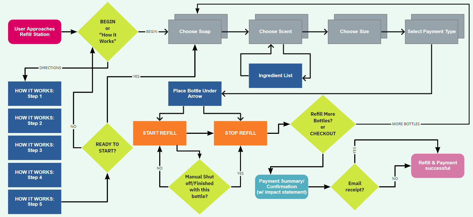
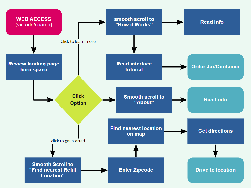
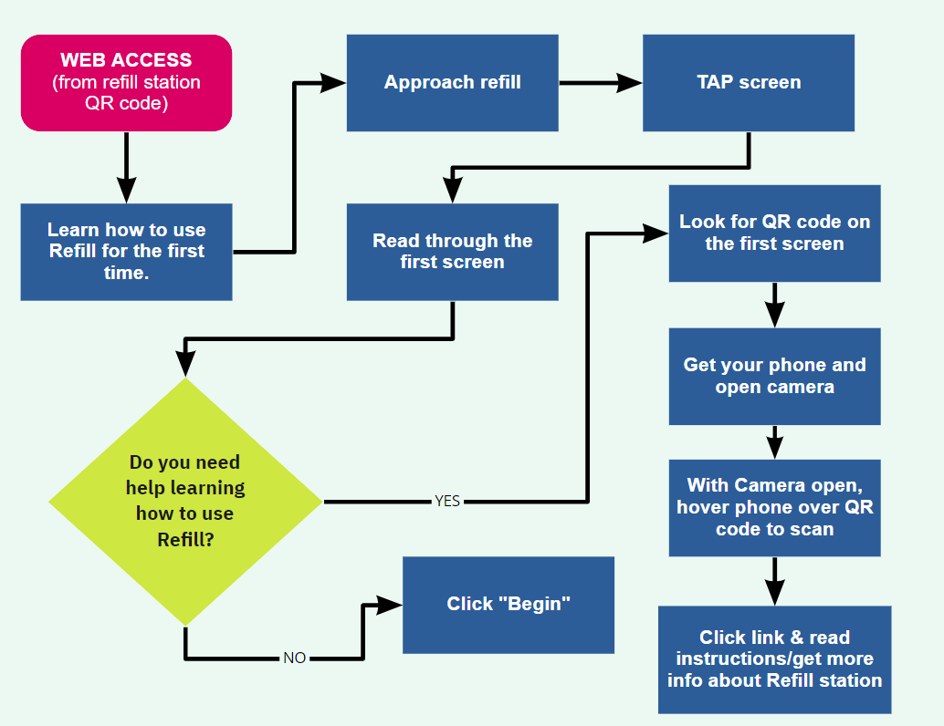
USER FLOW & TASK FLOW
Because we were designing two experiences, we had two user flows plus one task—scanning the QR code.
My user flow of the refill station
Web Access
Scanning QR Code
SKETCH > WIREFRAME > PROTOTYPE & TEST
My main contributions:
Interface Design Concept & Sketches | Mid-Fidelity Prototype | Usability Testing Plan | 2 User Tests
Starting from Scratch
Designing the station interface...and a web experience!
My Refill Station Interface sketches
Initially, the idea was to have fun facts and helpful encouragement along the way, which later turned out to be too busy/distracting for the user.
My Mid-fidelity wireframes
USABILITY TESTING PLAN & RESULTS
MID-FI USABILITY TESTING RESULTS (Interface):
Users wanted scent/detergent strength to be separate choices
Users wanted to see the price of the product
Confusion on the start/stop during the refill process
MID-FI USABILITY TESTING RESULTS (Web):
It wasn’t clear the site was for a refill station
Users don’t trust testimonials
Clean and easy to navigate
Station Interface Mockup & UI Style Guide
My Main Contributions:
Homepage | “How it Works” | Color Palette | Various UI Elements & Bubble Graphics
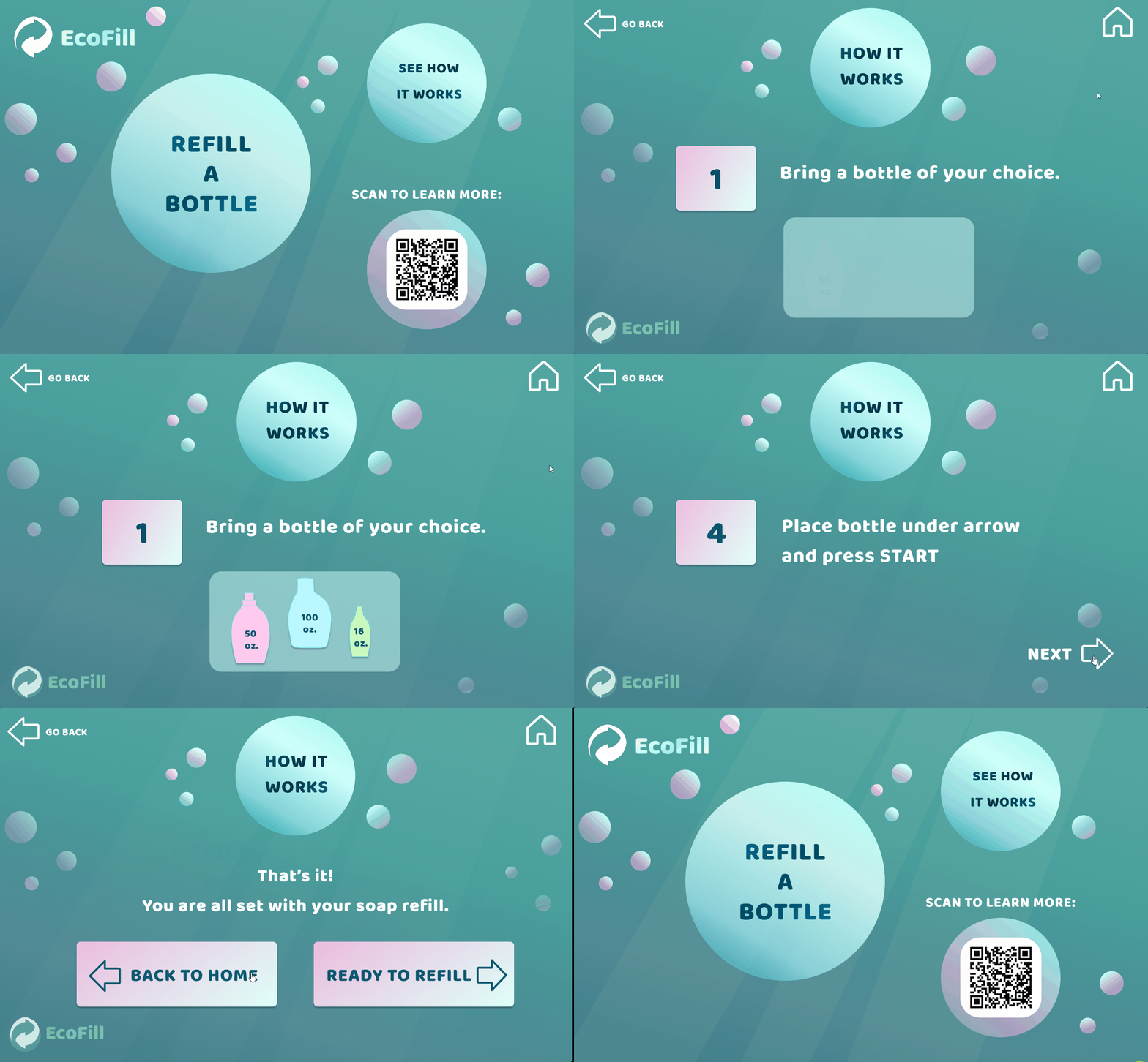
My overall inspiration of the design was, of course, the ocean, and more specifically: jumping in and experiencing that rush of bubbles around you. I transformed the idea of air bubbles into soap bubbles to build a theme for the brand.
I choose a deep turquoise to reflect the beauty of the ocean and bright pink to bring out the soap bubbles. The goal was to make the experience fun and inviting for the user (ultimately for the user to form a habit), while maintaining accessibility.
Because this concept has not yet been mainstreamed, I knew it would be important for the user to learn how to use the machine first so they would know what to expect. This way, anyone in the grocery store could walk up to the machine and be able to quickly digest the process & potentially decide to refill.
It was necessary to add the note to give the user clarity about when they would be charged.
After mid-fidelity testing, I added this screen to streamline the payment process.
Front-End Mockup & UI Style Guide
My main contributions:
HTML, CSS: Logo Banner, How it Works, Mission Statement/Quote, Positioning/styling cleanup
Bootstrap: Navigation, Jumbotron & Subscription Form
Logo (Co-Designer) | Image Selection
Design
Designed in Figma
Front-End Prototype
Coded in VS Code - Published with Github Pages
UI STYLE GUIDE
ABOUT PAGE
Coded in VS Code - Published with Github Pages
What’s Next?
My Future Goals:
More testing on the final prototype
Re-vamp and/or polish the UI of the Station Interface
Pitch the product…and see what happens! :)


