U.S. Department of Interior Redesign
At just the first glance, it was clear the U.S. Department of Interior (DOI) website needed more than a fresh coat of paint. Even after the mild updates the department released on January 21, 2020 (days before I completed this project), the site still lacked in usability.
My redesign of the DOI provides an experience that meets user needs, with simplified navigation and inviting, calming aesthetics.
Case Study prepared for: UX/UI Bootcamp, University of Texas at Austin
Timeline: 8 weeks | Project Dates: 12/5/2020-1/30/2021

The Department of Interior is responsible for a plethora of bureaus, offices, and other services. In order to provide usability to the general public, a site with this volume requires tedious attention to information architecture.
The goal of this redesign was to completely restructure the navigation and provide pleasing aesthetics to ultimately give the user confidence that finding important information won’t be a headache, but a fun adventure that one could keep returning to.

MY ROLE & RESPONSIBILITIES
UX/UI Designer (Sole Contributor)
Current Site Heuristic Analysis and Annotations
Usability Testing (plan, facilitation, analysis)
Information Architecture / Sitemap
Sketching & Mid-Fidelity Wireframing
UI Design / Style Guide
Mockup & Interactive Prototype
THE PROBLEM
The current design is severely lacking in usability and nearly absent of positive user experience and defined purpose. Users are frustrated with interactions, navigation structure, and overall site layout. This negative experience is causing users to completely disregard utilizing the site as a tool or resource.
THE SOLUTION
Increase reliability: Information architecture redesign for desktop and mobile with improved and simplified navigation as the priority.
Provide a calming atmosphere: Create an aesthetically pleasing user interface design that gives the user freedom to browse and discover rather than getting in their way.
THE PROCESS
EMPATHIZE
In-depth annotations
Heuristic Analysis
Current Site Usability Testing
DEFINE
User motivation
User flow
Information Architecture
WIREFRAME
Low-fidelity wireframes
Prototype / Test
UI DESIGN / TEST
Define Style Guide
Design Mobile & Desktop Mockup
Prototype & Test
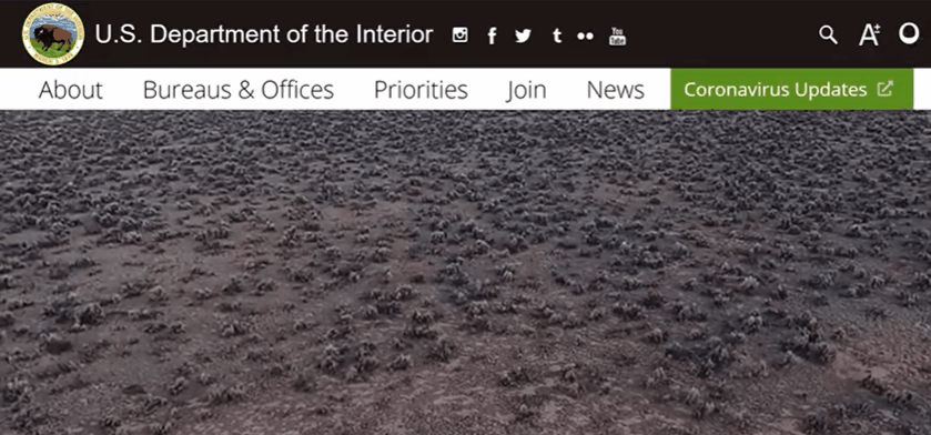
U.S. Department of the Interior: Site Analysis
(Site prior to 1/20/2021)
SITE ELEMENTS
Needless to say, I was successful in finding a myriad of usability and accessibility issues.


USABILITY TESTING RESULTS
Dropdown menus are too dense and lack order
Navigation does not match content
Hard to find general information
Pages are packed with text
Overall lack of efficiency with IA
ANNOTATIONS

USER FLOW
After conducting usability tests on the current site, I was able to complete a proto-persona and define a user flow.

INFORMATION ARCHITECTURE
Once the user research was complete, I moved on to defining the Information Architecture.
I knew this would be the most crucial step for delivering solutions, so I took my time.
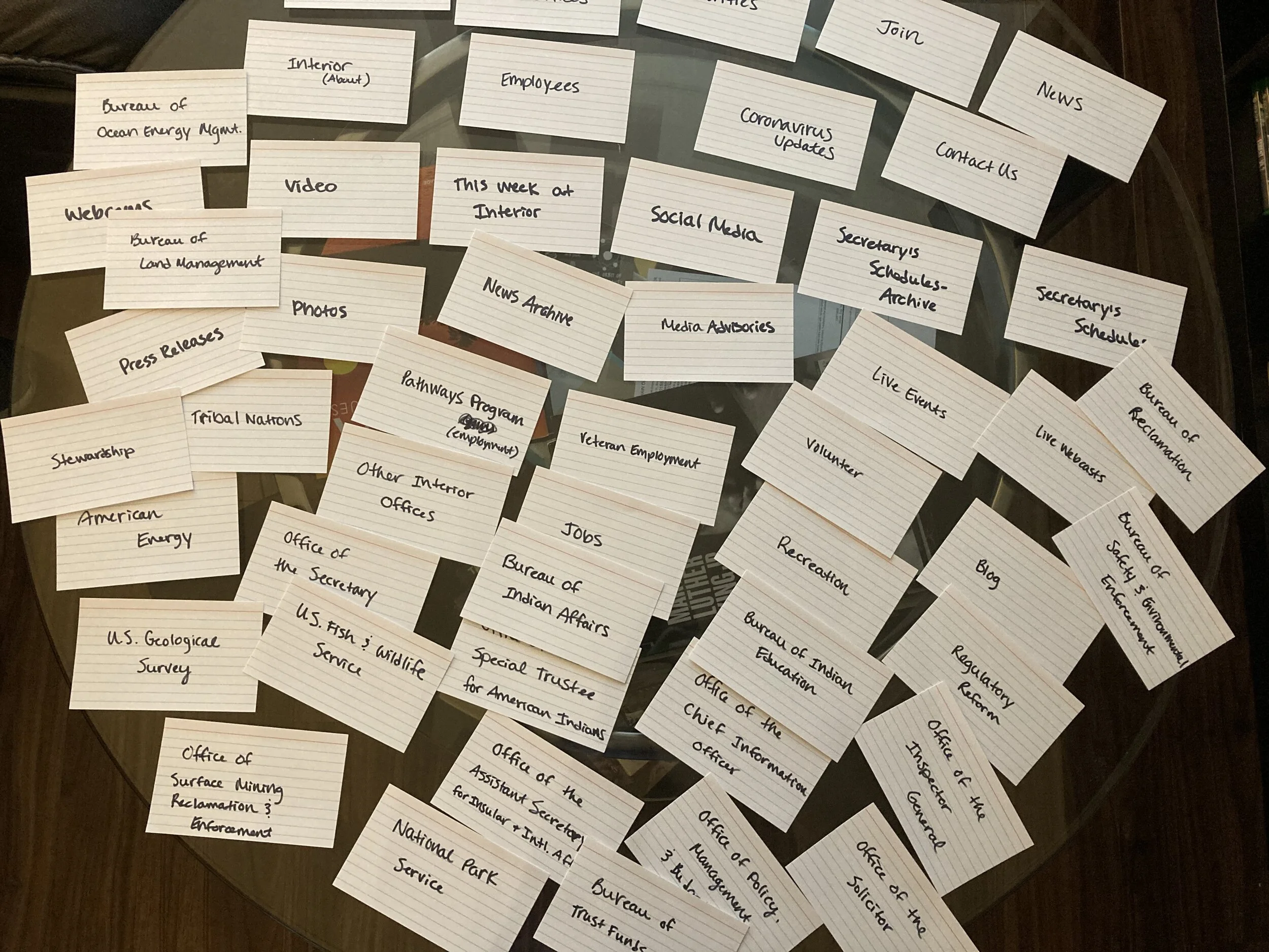
CARD SORTING
Starting a card sorting exercise was like a breath of fresh air.
Finally: a new sitemap could be formulated soon! I took the time to consider each page (primary, secondary, and tertiary level) and where it belonged, while creating new category names where necessary. And thus, I was one step closer to designing a brand new navigation system.
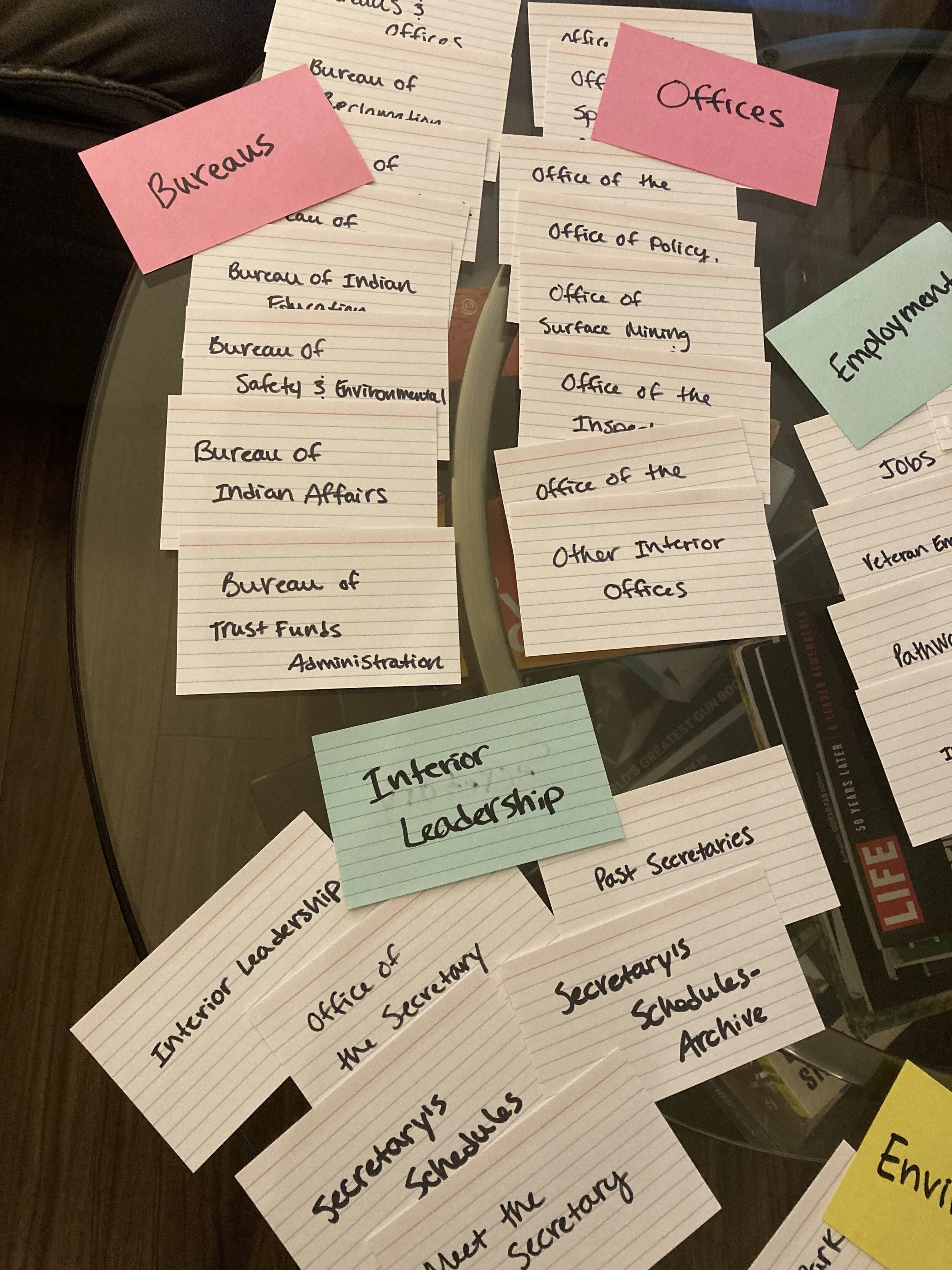
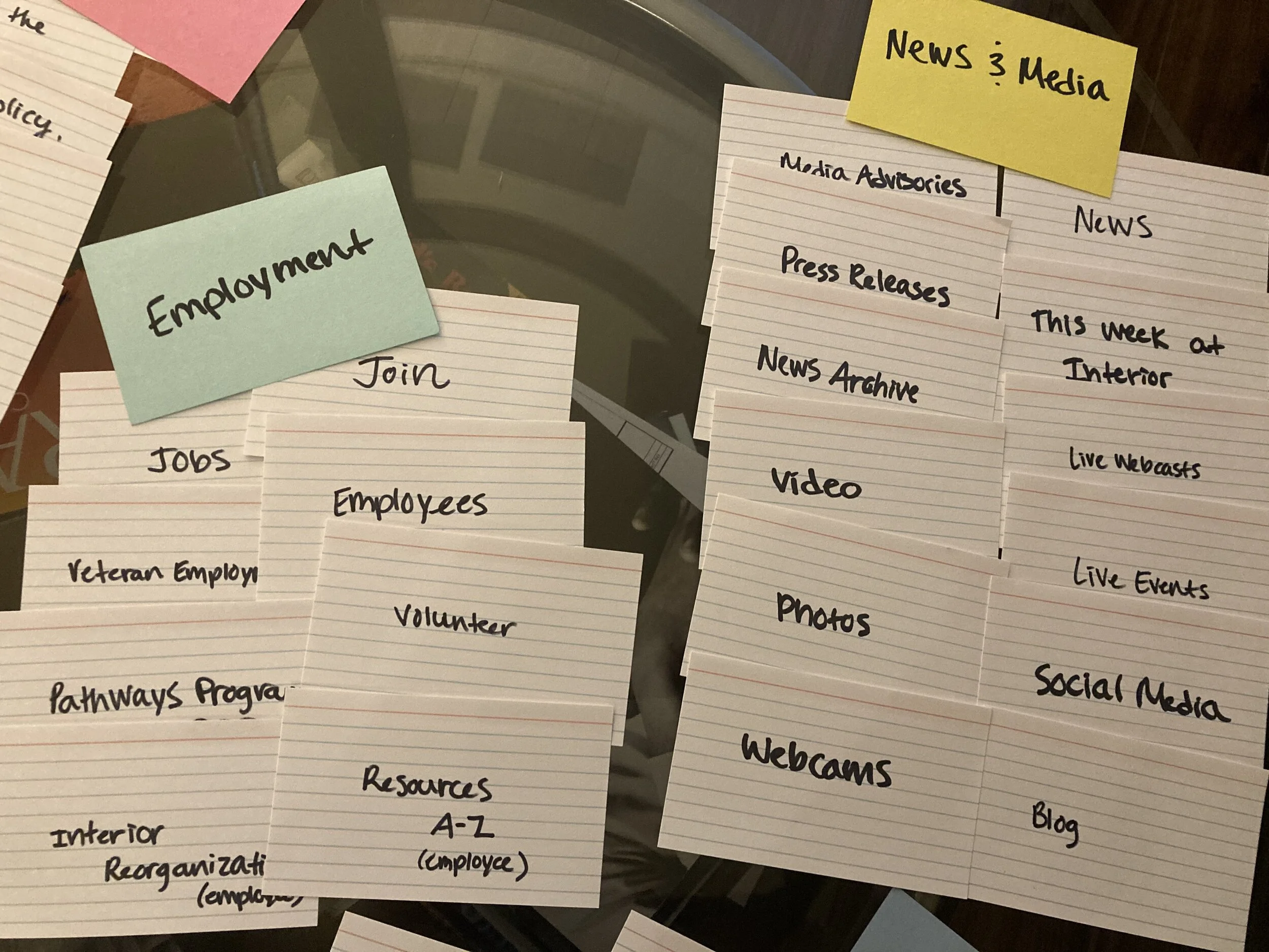
I combined pages to create new ones and re-defined pages and navigation elements, both to avoid redundancy that was frequent on the current site and to provide clarity for the user.
After defining where the categories and pages belonged, I took the opportunity to define the hierarchy of the primary navigation.
I like to use card sorting as a rough draft of the sitemap because it’s easier to move things around during this exercise (no page numbers to worry about editing yet!). Then I can rapidly create a strong site map once I’ve complete this step.
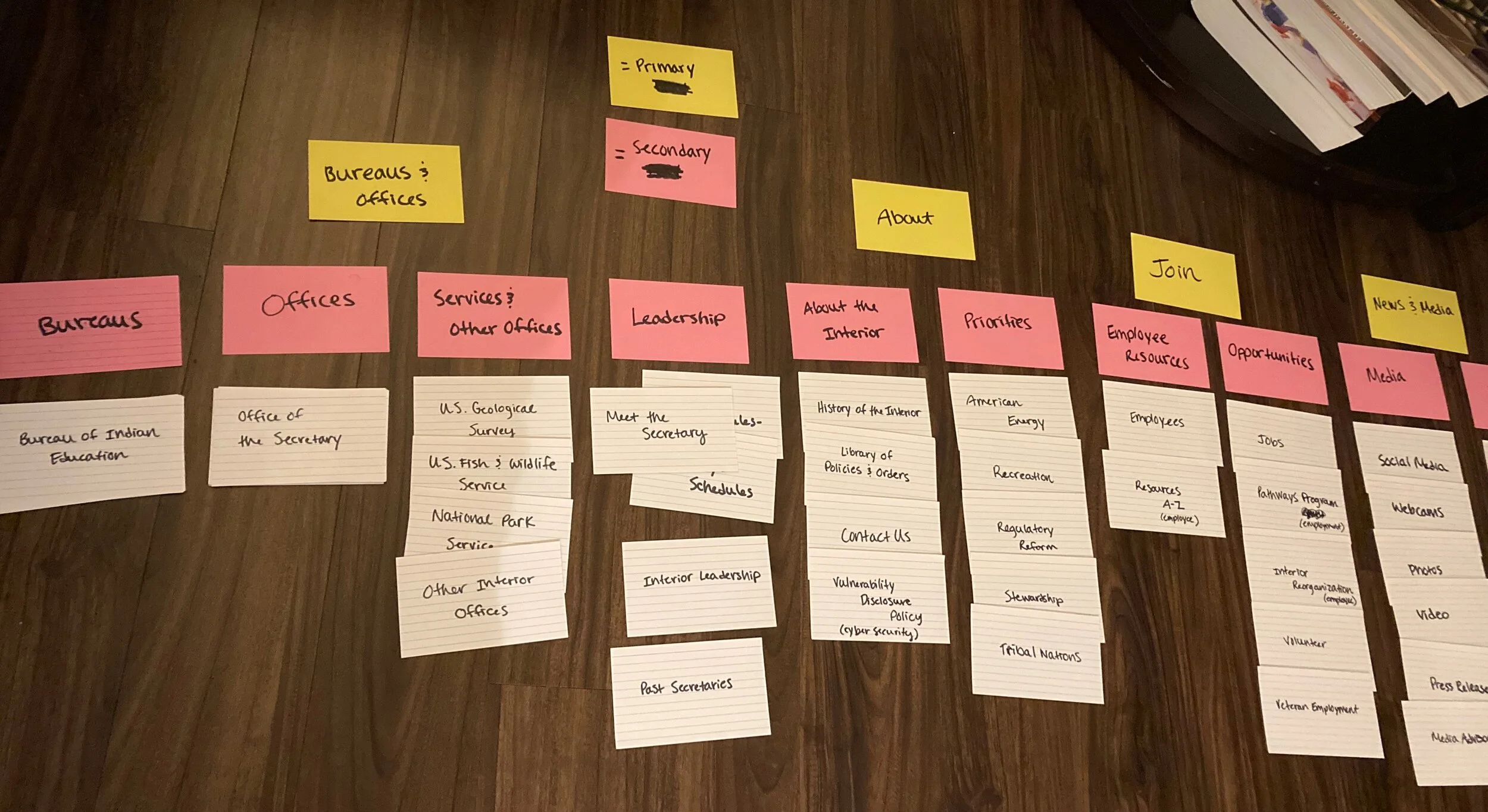
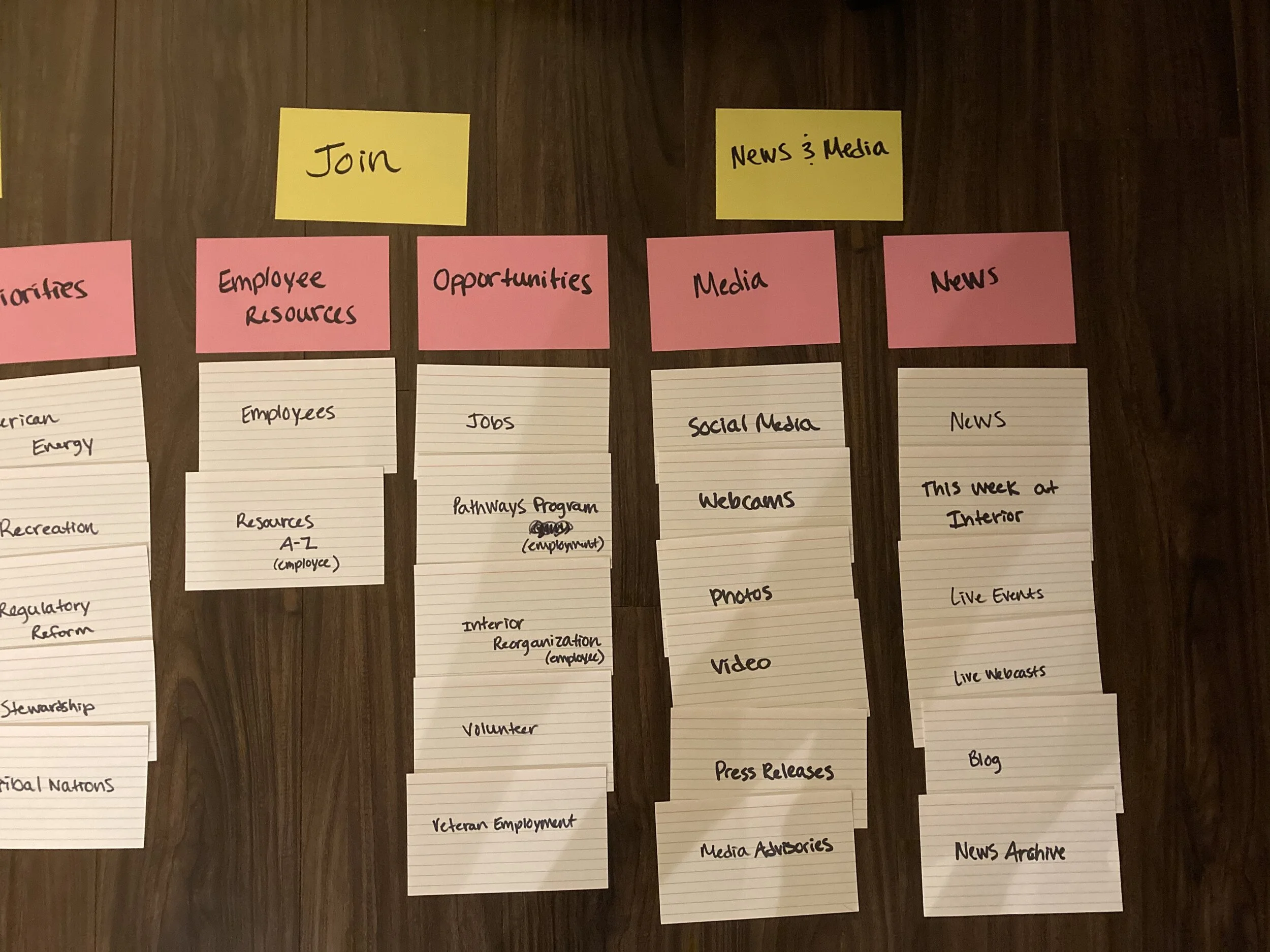
SITEMAP
After the card-sort, I was able to create the sitemap, utilizing the results from the first usability tests and focusing on a user-centric, simplified structure. I split the original navigation dropdown into Primary and Secondary Navigation levels, cleaned up the footer, and added a stronger tertiary level.

*Note: The sitemap does not cover the entire DOI site. This project purpose was to define the primary, secondary, and tertiary levels only.
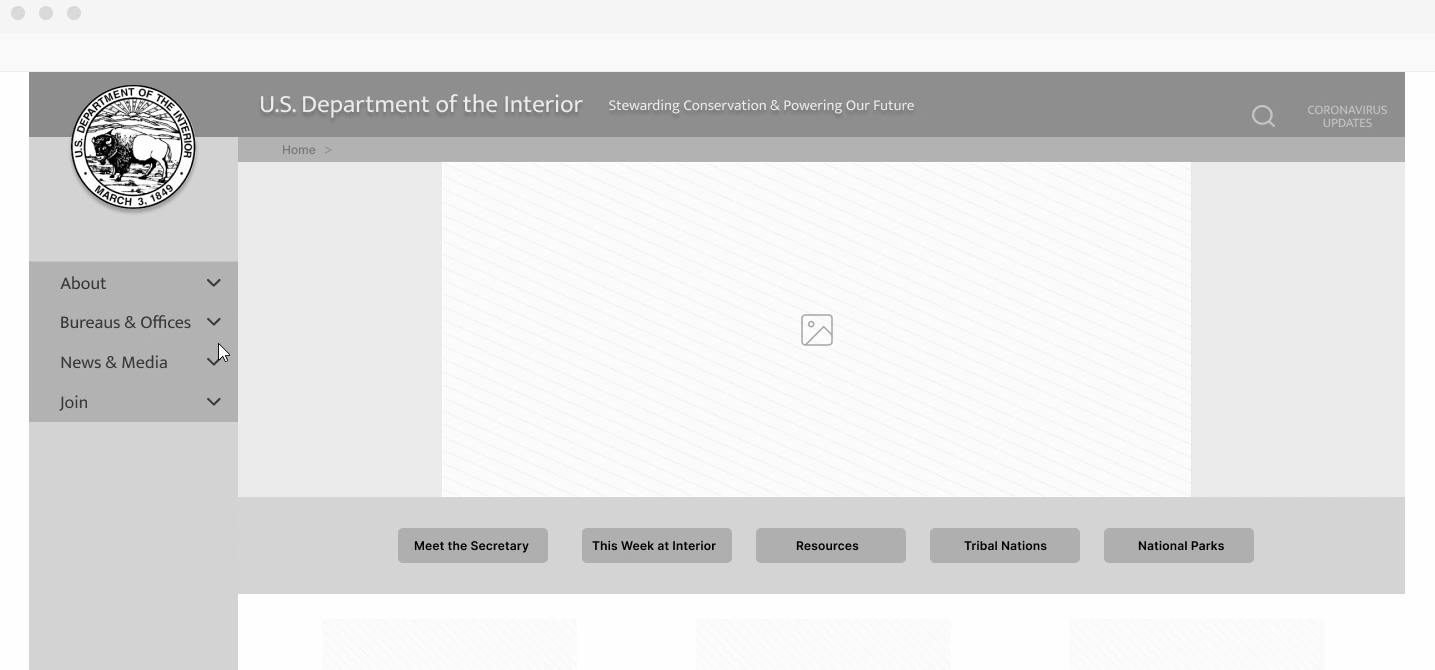
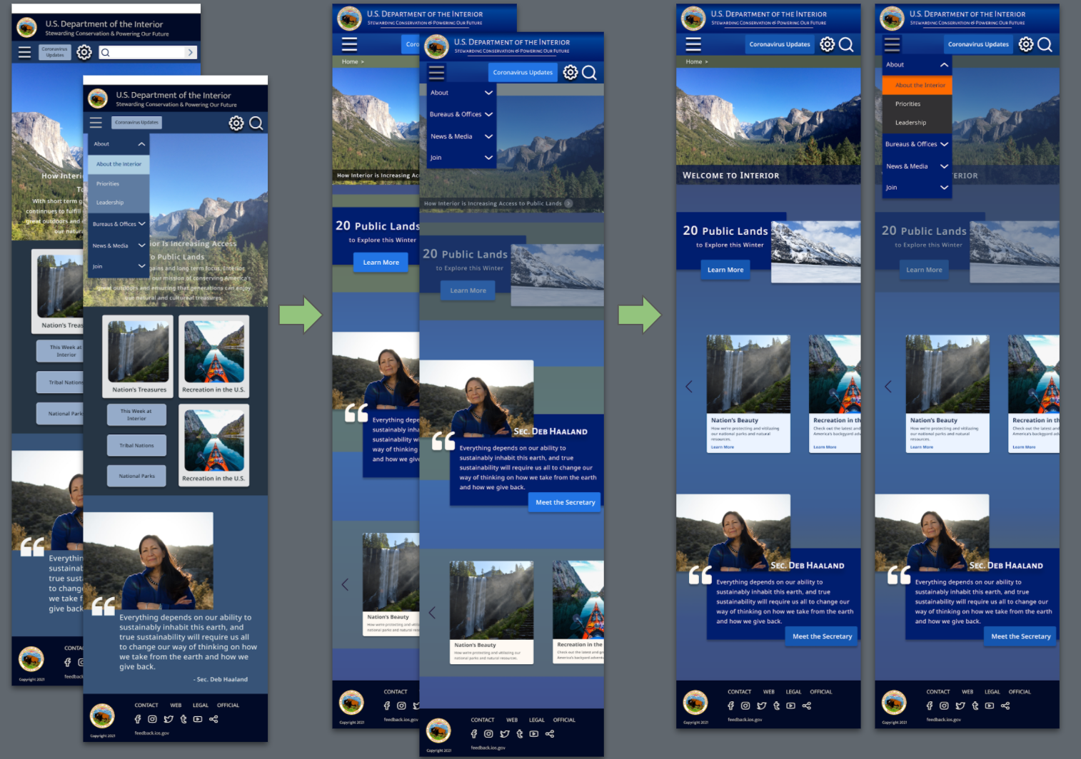
LOW-FIDELITY WIREFRAMING / TESTING
With the sitemap created, it was time to dive into wireframing. I created the navigation system first, and then added the components to wireframes.
First Concept to Low-Fidelity Prototype
ORIGINAL CONCEPTS

Original Navigation

1st Iteration


Mobile components

Lo-fi Homepage Wireframe

Navigation Function: Primary>Secondary>Tertiary
5 Second Test
Because the navigation was the primary focus of this project, it was necessary to test its functionality from the start. I created a quick prototype to conduct a few usability tests and a 5-second test.
RESULTS:
The navigation made sense to the user; Secondary and Tertiary navigation tabbing was well-received
Center buttons were the first elements that caught user’s eye and was regarded as primary navigation
Mid-fi Iteration: lightened the color of the center buttons
Later Iteration: took away middle buttons altogether
HIGH-FIDELITY WIREFRAMES
Gathering inspiration from a mood board that I created earlier in the process, I developed a draft of the style guide with a style tile. After testing the navigation, I formed my first high-fidelity wireframe, adding color, images, and typography.


Homepage: Desktop/1st Iteration

Homepage: Mobile/1st Iteration
Mobile: 1st Iteration - 3rd Iteration
UI STYLE GUIDE

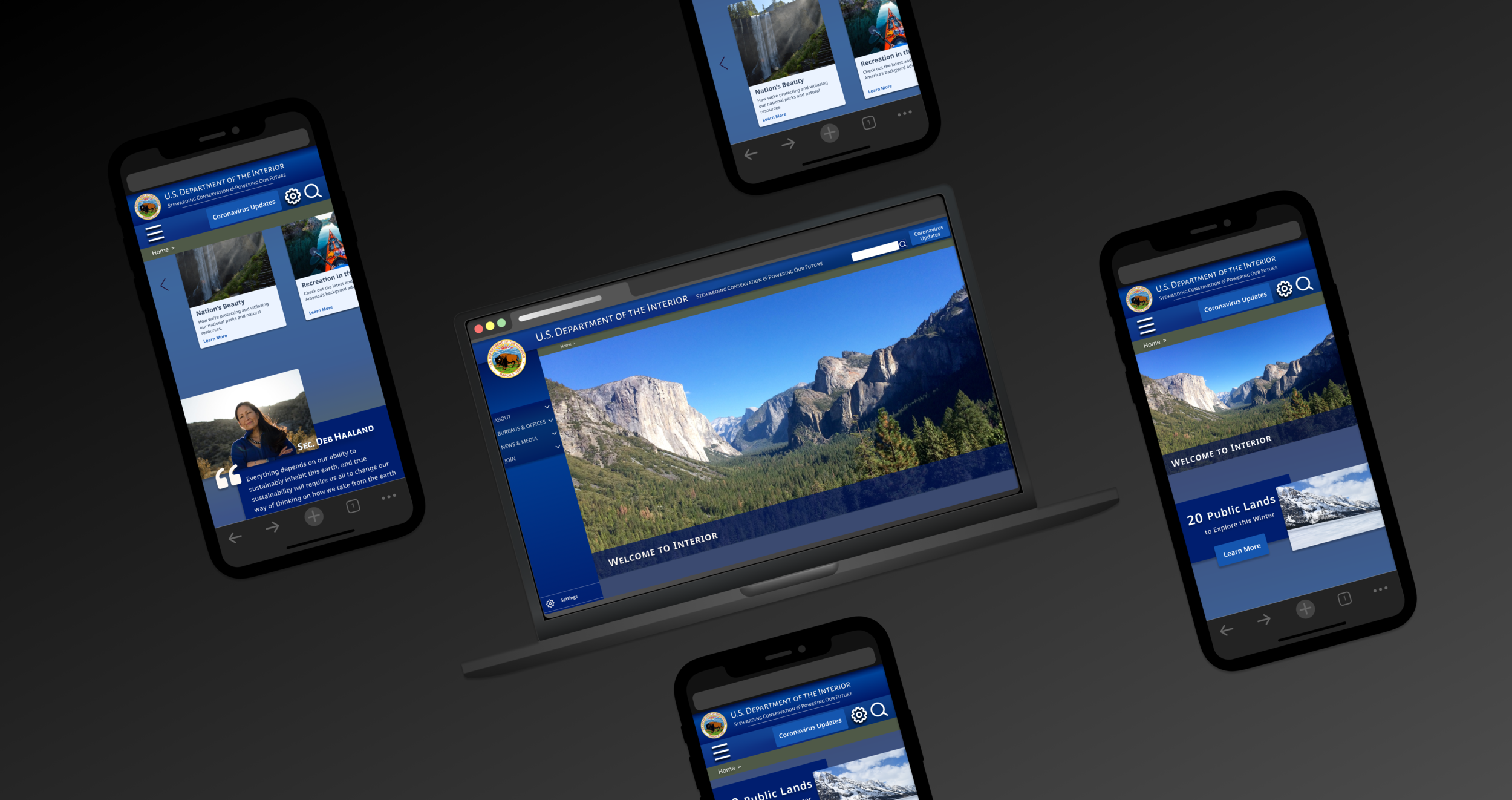
FINAL MOCKUPS
(8th Iteration)


Mobile Mockups


MOBILE MOCKUP USABILITY TESTING
For the mobile mockup design, I conducted 5 usability tests with users ranging from age 22-65. The final round of testing didn’t reveal any glaring issues, and the design didn’t get in the way of users. However, as with all design, there are always iterations that can be made!
Due to the remote nature of pandemic life, all testing was done on desktop, which did make it slightly awkward for some users, and may have affected the results.
RESULTS:
Card carousel was well-received and appreciated
One user felt the cards should be priority as far as hierarchy (i.e. they wanted to see them closer to the top of the page)
The hamburger menu was universal to the tested users
Feature 1 stood out the most, and pulled users in

Future Goals
Conduct user testing on the final desktop mockup
Fully execute the card carousel on different pages
Continue designing an interactive map / “National Park Journey” experience for the homepage hero space
